I've been thinking for a while now that we need some kind of logo for the Terminal Window / Radio project. I've messed around with a few ideas but never really came to anything. So I think we should try and get one together. I don't think we need two logos - one for Terminal Window and one for Terminal Radio - I reckon just one will be enough for the whole project. Here's what I came up with so far - excuse the shit drawings. I know Terminal Window is a computer term but I was thinking along the lines of terminal as in health / death so I thought that we could use the life support line - like this:
with a combination of a window image.
But it doesn't seem to work. I think maybe its too similar to the Microsoft Windows images? So if anyone has any ideas or suggestions?
Yes Beetles , great idea for logo but yes maybe some few similar to windows logo and well, terminal window , suggest a terminal for airplanes , i suggest make something like this (im but with footages still then made a handmade idea ok?)
Herd- I really like where you're going with the middle-left logo of the 2nd (middle) image., with terminal written underneath. I can envision that being a really slick logo. 2 Black bars in the back, white life-line with a blueish glow.. terminal in the fsol/isdn font just messing around:
Yeah, Id agree with Pandemonium, something dirtier looking, I like the very first image of the topic a lot, the signal on the oscilloscope that is, dont know if that would work for a logo though as dirty as it looks.
cheers for the feedback. I'll try and get some versions together soon and we can all have our say. Personally I think the less words included the better so in that respect I'd say I'm swayed towards Nmesh's idea. I think the use of the Dead Cities font ties it in with FSOL which to me is important. I'll try and do some dirtier versions and see how that looks.
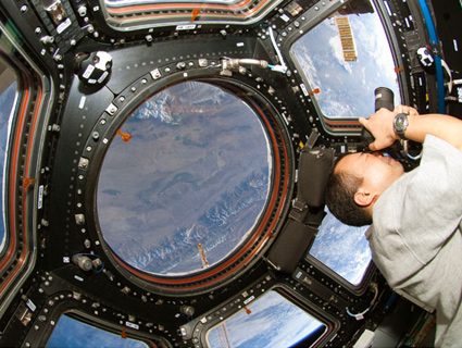
I was looking through the sketches with the windows again and an idea came to me - maybe not a typical window, spacecrafts have windows too, they are round in form and some are even more interesting geometrically. And this idea might be also closer to the "Terminal" theme. Dunno, just an idea, these are from google but there are more photos too.
I'm liking that Akkya.I reckon maybe a combination of that symbol with the flatline monitor symbol inside a hexagonal space window.I'll try and do some versions tonight.
I've been messing around with Dubmasta's space windows and adding Akkya's Terminal Window idea - I think we might be onto something with this one.
I like that its very abstract - the >_ could be very straight clean lines and the top window could be dirty not so straight lines. What does everyone else think?